To be effective, dashboards need to clearly communicate your most important KPIs and metrics. A large part of this comes down to dashboard design. Don’t worry, to create a great dashboard you don’t have to be an expert designer, especially if you’re using the right dashboard tool.
However, bad dashboard design can actively work against you and essentially negate the benefits.
The key to building an effective dashboard is understanding where they fit in and how they will contribute to your strategy. While many of us probably have a good idea of what we should do when creating a dashboard, it’s just as important to know what common pitfalls to avoid.
Here are some of the most common dashboard design mistakes we’ve seen and how you can avoid them.
1. Skipping the planning
If you’ve got a great dashboard tool, it can seem redundant to sit down and plan out a storyboard or wireframe, but skipping this step often leads to confused design, muddled data, and general ineffectiveness.
Communicating information to stakeholders, especially those who may not see the data day-to-day, requires thought and planning. What seems obvious to you may not be to them, which in all likelihood will lead to misinterpretation of the data, causing issues.
What to do
Before you start building your dashboard, ask yourself these three questions:
- What is this dashboard trying to achieve?
- Who is going to be using this dashboard and what are their goals?
- How will stakeholders be using this dashboard?
Once you have the answers to these, you can start planning out what your dashboard will look like, from the KPIs you’ll include to the types of visualisation you’ll use.
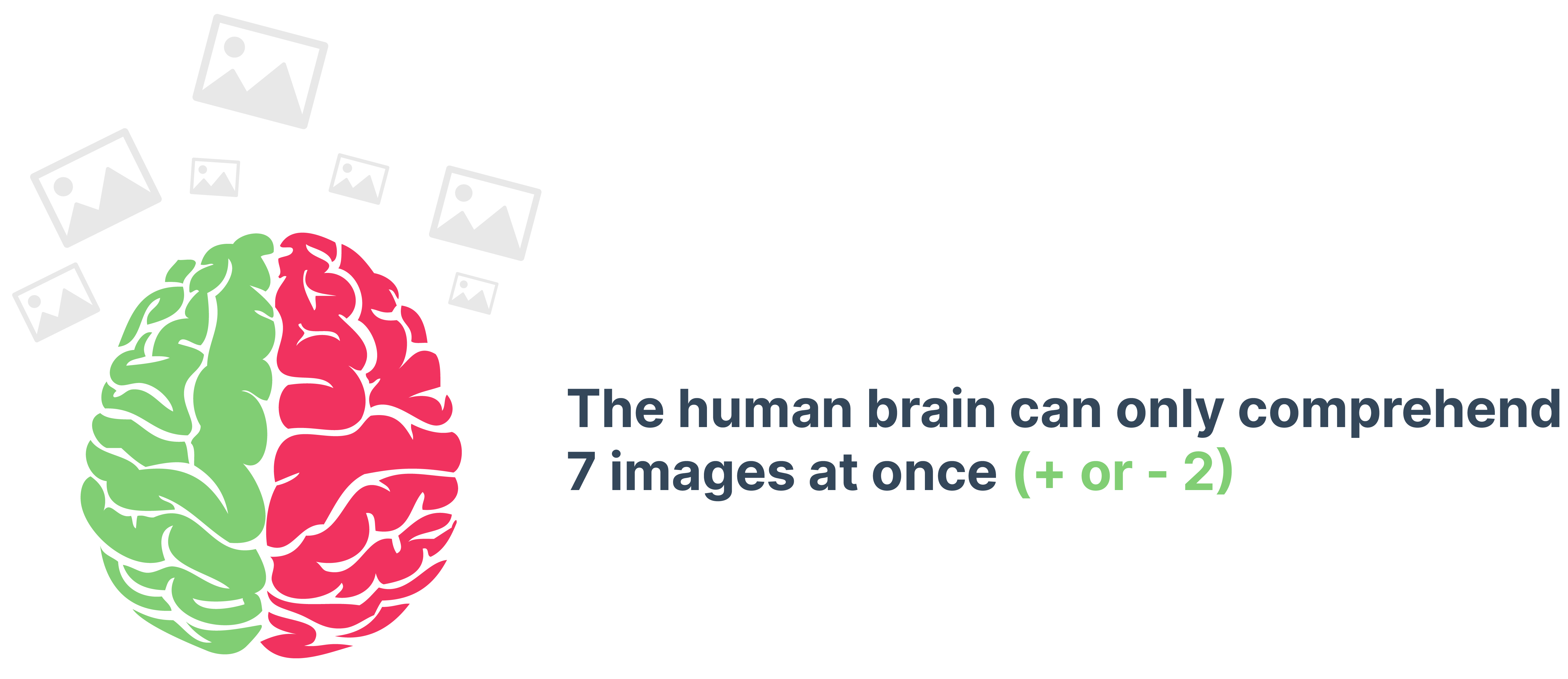
2. There’s too much
When it comes to dashboards, less is definitely more, both in terms of the amount of data you include and the number of visualisations you use. There’s a temptation when designing a dashboard to include all the data you have at your disposal because you think it will make your progress clearer. In fact, it does the exact opposite. Including too much on a dashboard makes it not only look cluttered, but it can confuse the point.
The same can be said for the (over)use of visualisations. We all love a good line graph, but every inch of your screen space doesn’t need to be a myriad of colours and charts. A well thought out graph or table has a real impact, but anything more than a few visuals are hard to take in.
What to do
Before you even start building the dashboard, focus on what key metrics and KPIs you want to include. If you have too many, think about splitting up your dashboard into two. For example, a marketing team may want to track all of their website statistics, but then also show how their social campaigns are progressing. Instead of trying to put all of that information on one dashboard, split it into a web metrics board and a social media board.
And when it comes to visualisations, be exacting with which ones you choose. There should be a purpose to including a chart or graph, and making your dashboard pretty doesn’t count.
3. Not using the right visualisation
Not every chart is created equal and not every visualisation will be appropriate for your data. Just because you can use something doesn’t mean you should. When it comes to choosing what types of visuals you want to use in your dashboard, there is a lot more to it than just what you think might look nice, or even what other people are doing.
The problem most people face when they build their dashboard is not thinking about the type of information they are trying to display and what it actually means. Every chart, graph, and table option was designed for displaying a specific type of information. When you don’t identify that purpose, you’re at risk of missing vital information from the data.
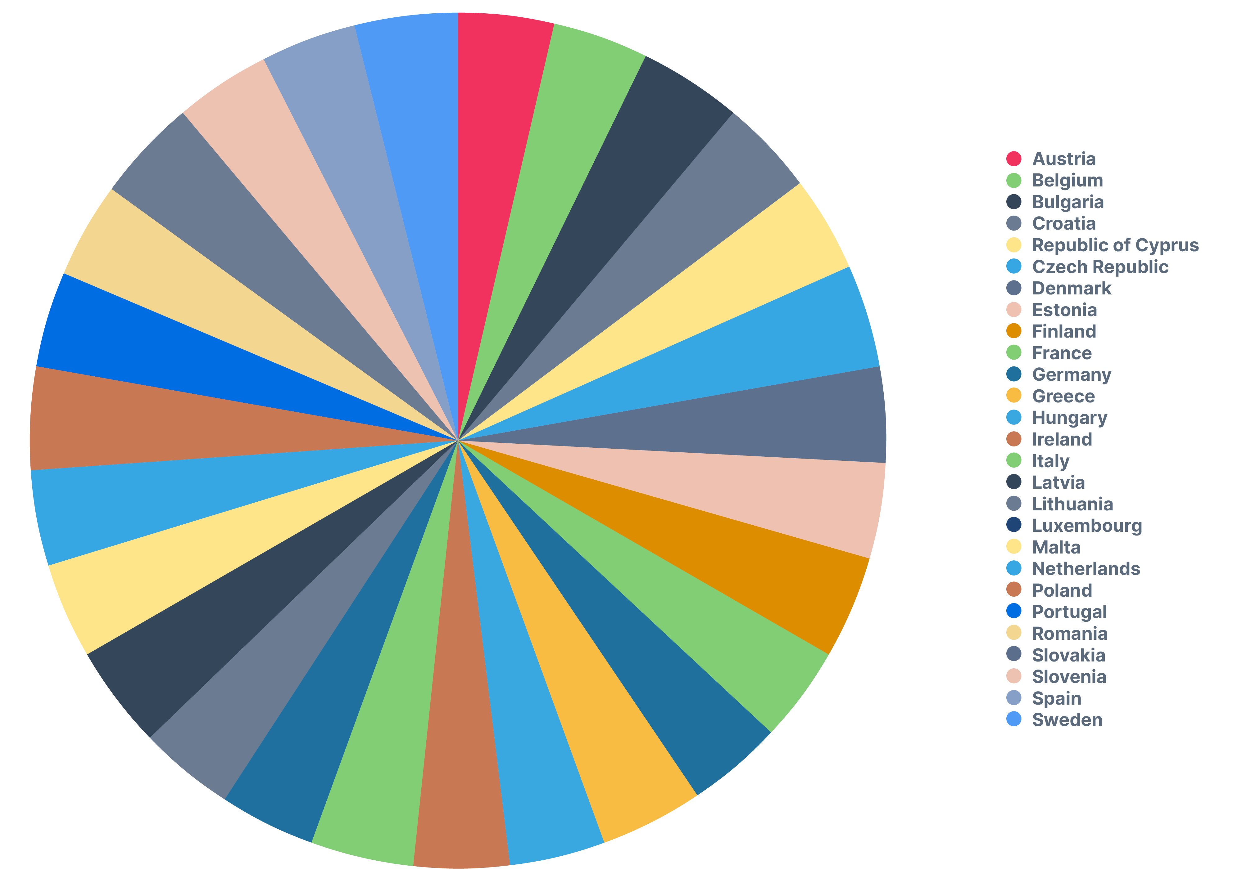
Take this pie chart, for example. There are too many data points to make it a good visualisation. There is no real way to interpret the data in the chart in a useful way.
What to do
Before deciding on a chart or graph, consider the type of information you have and then choose a visualisation that best supports that data.
| Type of Information | Definition | Best Visualisation |
|
Relationship |
Connection between two or more elements |
Scatter graph |
|
Comparison |
Compare two or more pieces of data side by side |
Bar chart |
|
Composition |
Breaking data into separate components |
Column histogram |
|
Distribution |
Range and grouping of values within data |
Pie chart |
4. Not providing context
The data on a proper dashboard should speak for itself. That doesn’t mean, however, that your data requires no context. This is a common mistake when creating dashboards, adding in numbers and visuals without any sort of explanation or story, especially when it’s being shared with stakeholders who are only looking at it sporadically.
‘Last week’s leads’ may be something you want to track, but it provides no actual context for progress. Where did the leads come from? Are there more or fewer than in the previous period? Did they go on to convert? Vague data means slow action and indecision.
What to do
This all goes back to the planning stage - think about who is using the dashboard and how they’ll use it. And make sure your data tells a story. For a KPI like lead-MQL conversion rate to be effective, it needs to be followed to its logical conclusion, so ensure you follow the lead all the way through the funnel. This way you can show quantity and quality.

5. Unclear language
Context can be helped - or hindered - through your use of language. One thing a lot of people overlook when creating a dashboard is that not everyone in their company will use the same language or understand the same abbreviations.
A marketing manager will know what an MQL is but a customer ops manager may not. Trying to save space is great, but the goal of a dashboard is to be understood at a glance, not after you Google what a KWR is (keyword report for those who don’t want to Google it).
What to do
Not to sound like a broken record, but it comes down to your users. If they are not part of your day-to-day processes or data, more may in fact be better. What do I mean? Well, quite literally spell it out. Instead of abbreviating, write out elements like ‘Marketing Qualified Lead’ or ‘Click-Through-Rate’ if you think your audience may benefit from it.
That being said, use common sense. Most managers or executives will be familiar with terms like ROI, so use your best judgement to find the balance between over-explaining and providing the right level of context.
6. Not reviewing and revising
As much as we all like to think we get everything right on the first try, that’s not the most realistic outlook. The same can be said for dashboards. No matter how much effort and planning you put into it at the beginning of the process, in all likelihood there will be things that don’t work or changes in circumstances.
However, a lot of people look at dashboards as set-it-and-forget-it. They create a dashboard, ensure it’s pulling in updated information, and then leave it. They check it for updated data of course, but they don’t check in to see if it’s fit for purpose.
What to do
Review your dashboards regularly with your stakeholders. Ask for feedback to ensure they’re being understood, are achieving their goals, and are generally useful. If the answer to any of those questions is no, don’t be afraid to make changes to your layout and data. Dashboards should be an interactive product, ever evolving to ensure they are doing their job.
Conclusion
Dashboards can only be useful when they are properly designed. The number one thing you can do is plan properly. If you do that, all of the other elements should come together. But remember, there is no shame in changing your design if it’s not working. Just make sure that any tools or software you use to build your dashboards are flexible and customisable so you can create amazing dashboards that will keep you and your team on track to achieving your goals.

Share this

6 Benefits of KPI Reporting

The Gestalt Principles: How to Use Them in Dashboard Design