Psychology and design are more closely related than a lot of people realise. Every design, whether it’s on a website, on a billboard, or on the streets around you, comes directly from or has been influenced by perceptions of human nature. And dashboards are no different.
At their core, dashboards are meant to simplify data, making it easier to see and absorb, allowing you to make better data-driven decisions. But have you ever wondered why dashboard design principles recommend a lot of white space or why hierarchies are important? It’s deeper than ‘it just looks’ pretty; there are many theories out there that could be used to provide context. In this blog, however, we are going to look at the gestalt principles.
The Gestalt Principles
The gestalt principles look at human perception and are based on the human tendency to intuit patterns when processing information, including visual information. One of the core tenets of the principle, which translated from German means ‘unified whole’, is that people tend to group similar elements, recognise patterns, and simplify complex images.
The principles date back to the 1920s, when German psychologists Max Wertheimer, Kurt Koffka and Wolfgang Kohler, were undertaking work that aimed ‘to understand how humans typically gain meaningful perceptions from the chaotic stimuli around them.’ This led to the creation of the laws or principles regarding how humans perceive visual stimuli and how we find order in the world.
What does this have to do with design?
In short, everything, given that the gestalt principles define how humans perceive the world. Design, in this case, is just another complex set of visual information that people have to make sense out of. In fact, graphic designers adopted the principles very early on, and have essentially been using them ever since.
When it comes to dashboards specifically, the gestalt principles or gestaltism can help in a myriad of ways. To see exactly how though, we’ll go through some of the principles and outline how you can apply them when building your dashboards.
- Similarity
- Continuity
- Prägnanz
- Proximity
- Symmetry
- Closure

Similarity
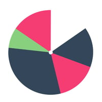
The principle of similarity says that we group elements together when they appear similar to one another. Similar can mean anything from size to shape to colour. Pretty simple, right? So how can we apply this to dashboards?
This can be useful when trying to show a relation between elements that aren’t necessarily next to one another on a dashboard. For example, you can use the same colour in different graphs to represent revenue. The similar elements allow us to automatically make a connection between the two, allowing them to compare and contrast quickly.
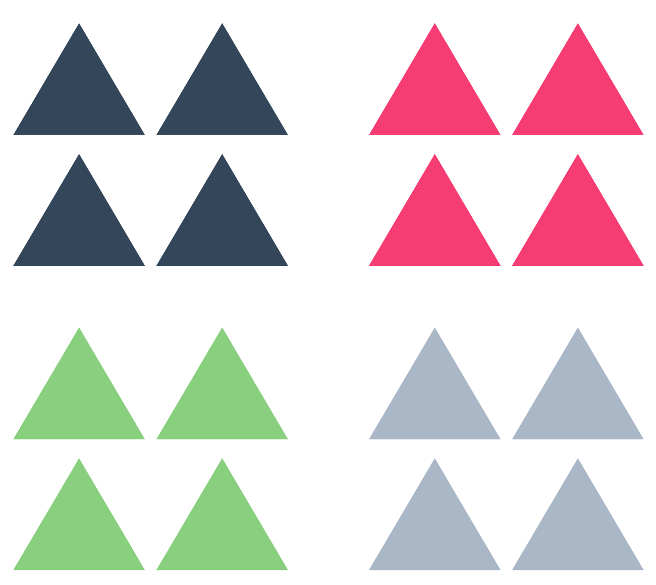
Let’s use this image as an example. We can immediately group these shapes into 4 distinct sections based on colour alone. In a dashboard sense, similarity makes it easy to scan and retain information quickly, which as we know is the main benefit.
Similarity can also be used to highlight an element you want to stand out. By making it different from the other visualisations on the dashboard, whether in colour, shape, or type, our eyes will be drawn to it, making the distinction that it is different or ‘important’.
Continuity
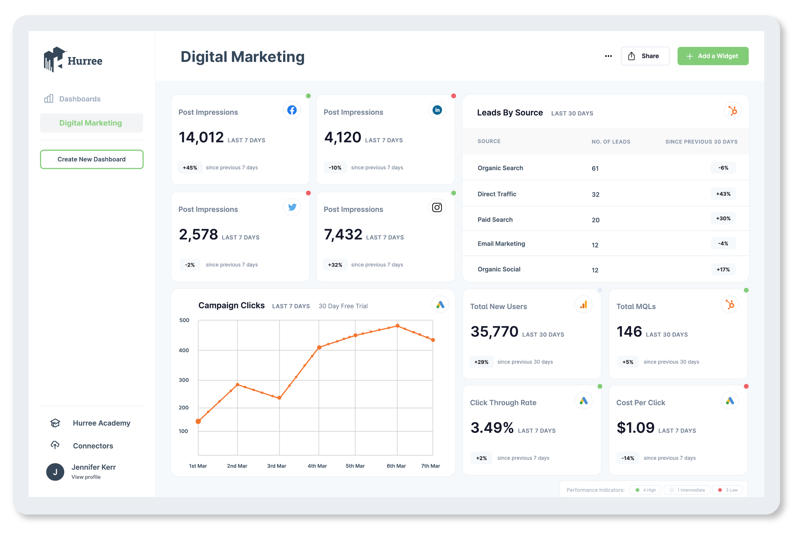
Continuity posits that ‘oriented units or groups tend to be integrated into perceptual wholes if they are aligned with each other.’ In other words, people perceive elements as related when they are aligned with one another or appear as a ‘continuation’. Our minds tend to follow paths and group elements aligned on a single path as related.
When applying this to dashboards or data visualisation, its value can be seen in its ability to guide your user's eye or attention. Placing information or elements in a series naturally guides your users through that information. This can be done either horizontally or vertically, so your options are flexible.
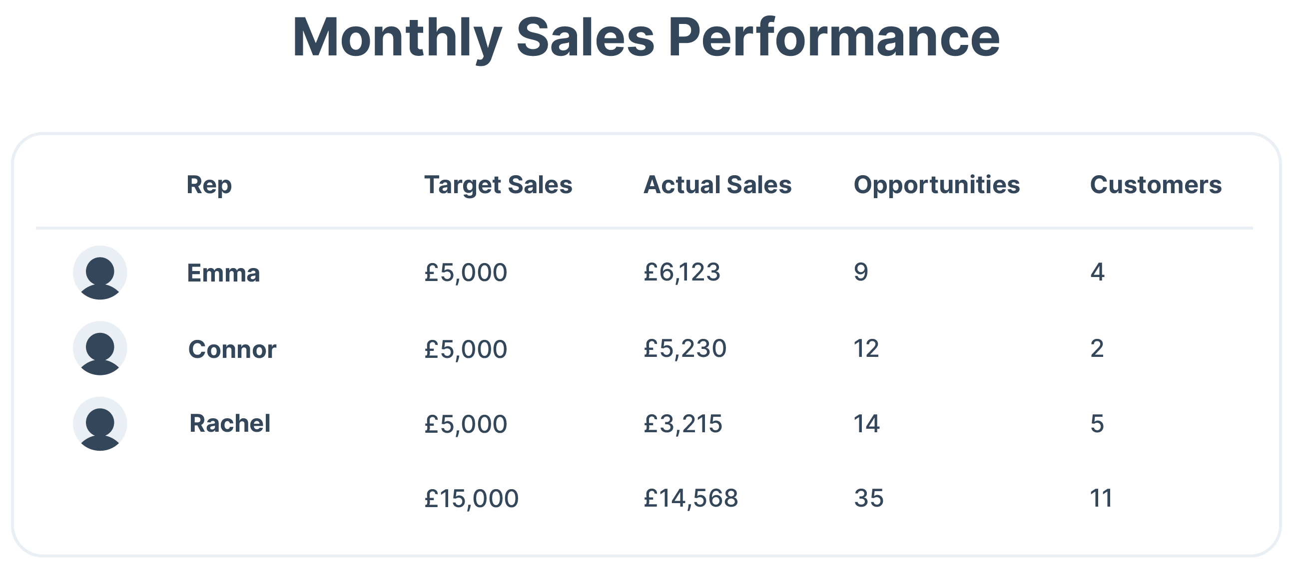
For example, if you want to show that a series of graphs are related to sales, you can group them horizontally. You can almost tell a story by aligning your charts on an axis or in line, allowing the user to follow the path you set out for them without them even knowing.
In the table below, for example, we see the sales figures for a team. Because of how they aligned, we don’t need the lines or directional indicators to make the information make sense, the user will follow the logical path.
Prägnanz
Prägnanz, also called symmetry and order, is German for ‘good figure’. So what does it mean? When presented with a series of complex objects or shapes, your brain will perceive them in as simple a manner as possible. One of the most commonly cited examples of prägnanz is the olympic logo. Even when it’s shown monochromatically, we still see it as a series of overlapping rings, rather than as a collection of curved lines.
While it may not be as obviously valuable for dashboard design, prägnanz outlines an important concept: simplicity. When building your dashboard - or any UX design - opting for the simplest options in terms of shape and layout make it easier for the user's brain to actually perceive the information you’re presenting.
Using this principle can be especially useful at the planning or wireframing stage of your dashboard build. It pushes the use of clear navigation, headers, labels, and position of the visual elements.
Proximity
The proximity principle states that elements that are close to one another spatially are more related than those spaced further apart - or at least that is what our brains tell us. That makes sense right? Things that are close together would be related in some way, so we can use this to help our dashboard users perceive information more clearly.
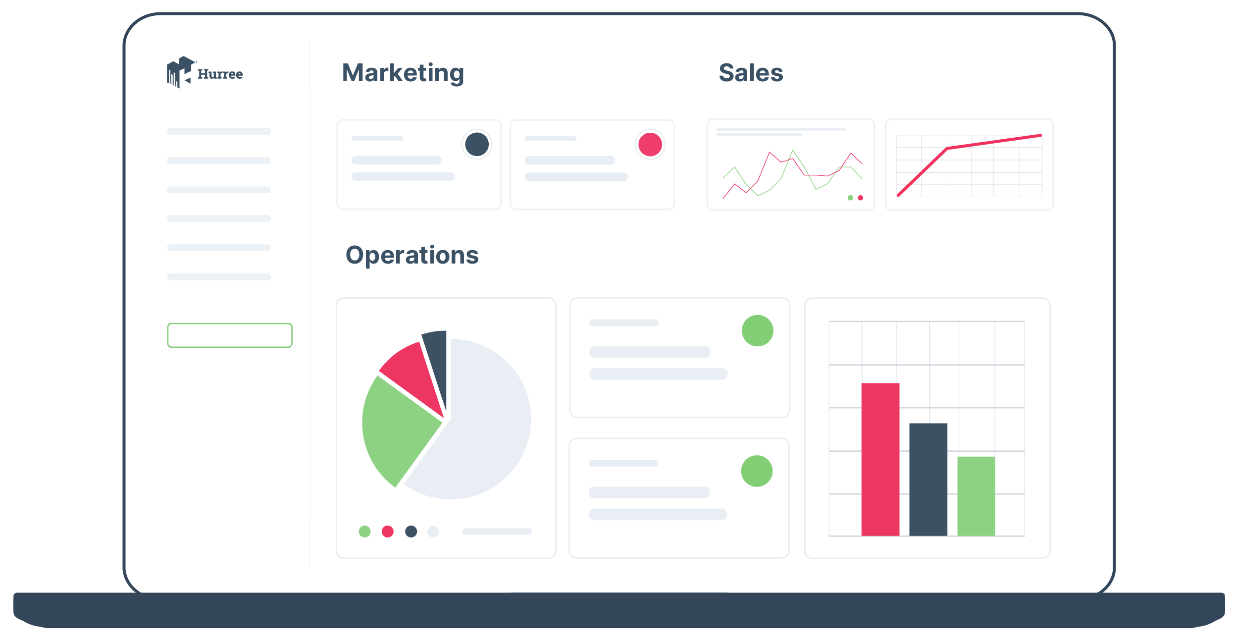
Quite simply, you do this by grouping related elements together. If you have visualisations that all relate to marketing, you would put those together. Whereas the sales KPI trackers would go in a separate group. You can take this even further by creating separate dashboards, and creating subgroups within those i.e. financial information, lead progress, customer growth, etc.
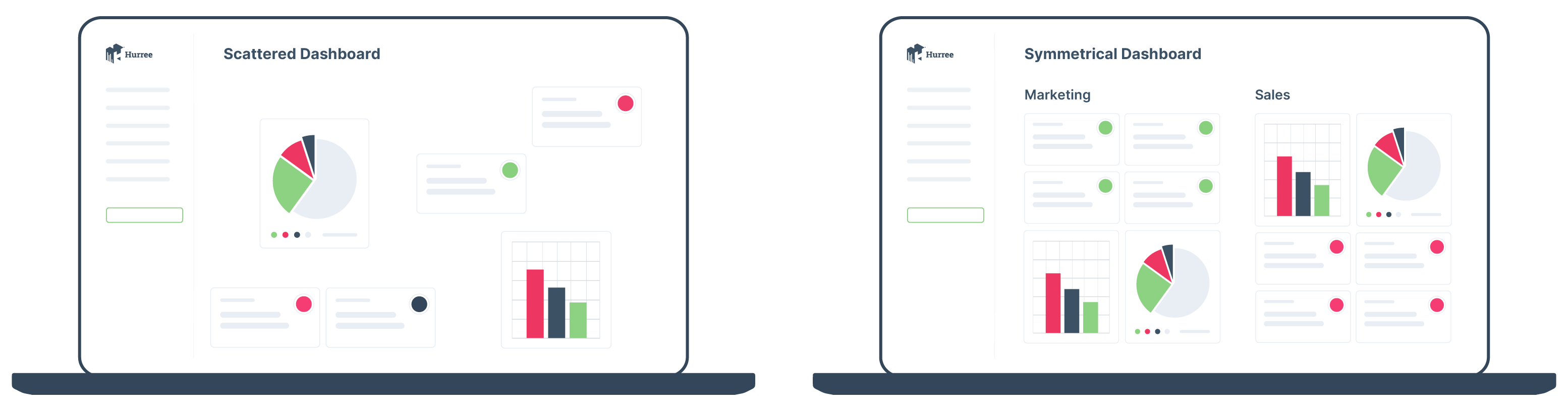
Symmetry
Have you ever found yourself hanging a picture or painting only to spend an hour trying to find the exact right spot for it? This may be due to the fact that, according to gestalt, our brains are more comfortable with symmetric elements than non symmetrical. It’s almost as if we have an unconscious need for balance. It may be because this balance or symmetry provides a sense of order, making even the most disparate of data feel connected and easy to understand. Elements that are symmetrical, according to gestalt, are seen to be part of a unified group.
When applying this to dashboard design, it can mean something as simple as ensuring your marketing and sales teams have the same number of visualisations, or that you don’t overload one side of your layout with charts and leave the other with one or two tables. It can also be used to show relationships between two groups of elements. If your sales and marketing groups have the same number of visuals placed in a similar way, the user can infer that those elements are showing similar information for the two teams.
Closure
Look at the logo below.
![]()
You can clearly see that it’s a panda. But it’s not really a panda is it, it’s an outline that looks kind of like a panda, almost incomplete. The gestalt principle of closure says that our brains want to see a complete picture even where there are missing elements, so it will often fill it in for us. So it means that we can look at the WWF logo and see a panda, or that we can see a pie chart that is only 3/4s complete and know what it is meant to represent.
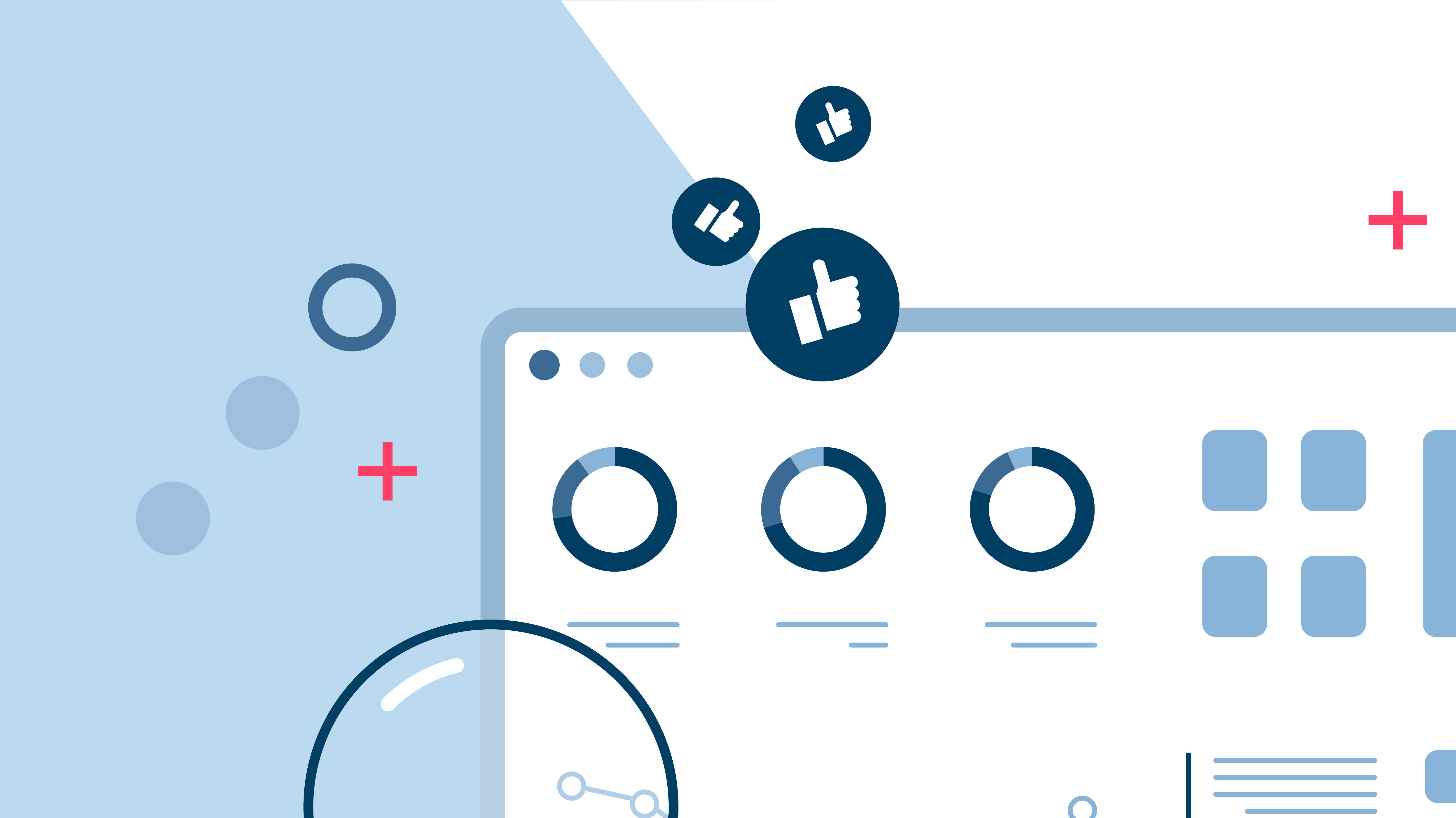
When it comes to applying this to your dashboard design, closure can be useful in making our users see an element with the smallest amount of information possible. This allows you to simplify your design and not overwhelm your user. In practice this would look like the example above, a pie chart that doesn’t need to be filled in to be understood, the use of icons rather than pictures to denote certain things, etc. It’s about keeping your visuals as simple as possible because your user's brain will likely intuit what it needs to. In writing terms, we would say ‘trust your audience’.
Putting it into practice
There has been a lot written about the gestalt principles and how they can be applied in different areas of design. Here, we’ve outlined how they can be used to make dashboards powerful and effective, so that your users can take in the information and use it to make data-driven decisions.
As you’ve seen, there are immense benefits to keeping these principles in mind when designing and building your dashboards, but overall, the gestalt principles will help you:
- Determine which visual elements will have the greatest impact on your audience.
- How to use design to influence how people digest the information and come to the right conclusions.
- Make your dashboards easy and effective for your users, so they will actually have the intended impact.
If you want to talk to us about how you can apply these learnings to a Hurree dashboard, then book a demo today.


Share this

[Infographic] 6 Tips to Impress Your New Boss
15 Facts That Show the Power of Dashboards