UX Design of Personalized Mobile Apps
What is personalization?
In the age of people overwhelmed with the amount of information they need to process every day, we observe a tendency of content being personalized in most of the popular mobile applications. In all social apps like Facebook, LinkedIn, Twitter and Instagram, users experience content that is similar to what they engaged with earlier. With Spotify or Netflix, users are offered shows related to what they've previously watched, i.e. things “they may also like”.
According to Nielsen Norman’s article “The main goal of personalization is to deliver content and functionality that matches specific user needs or interests, with no effort from the targeted users. The system profiles the user and adjusts the interface according to that profile.”
Personalization is based on users’ characteristics or their activity. Unlike customization, it doesn’t require data consciously provided by the user. For example, the algorithm can assume you’re having a wedding based on your searches and purchases.
Risks of personalization
The purpose of personalization is clear and practical – people want to consume more accurate content. From a marketing point of view personalization is more efficient, as showing ads to a chosen target audience gives a higher conversion rate. On the other hand, we can observe how social media apps are affecting society: people tend to get more detached from diverse points of view and lose empathy for those who are different.
As designers, we have a strong social impact, we have to consider the risks that come with our decisions. Now is the time to reflect on what is happening and build digital products that—while still being practical and accurate—give us the opportunity to face reality and see the bigger picture.
Another risk is that personalization still can quite easily be inaccurate. We all have had the experience of disappointment or irritation when looking for shoes and, after we have bought them, still receiving ads for those very same shoes days later. Or we have bought a gift for someone and once purchased, the ads were no longer relevant for us at all. The assumption that past interactions always shape future behavior is wrong. The mechanism that we use has to be smarter, more flexible than that and the data that we use for personalization has to be reliable.
Designing personalized user interfaces
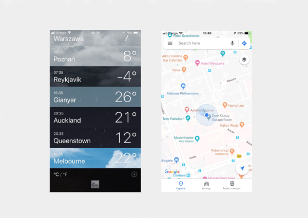
Personalization done right should include giving the user the opportunity to access data that is not personalized. The simplest example is Google Maps. First, when you launch the app it shows you where you are and suggests places nearby that you might be interested in, or have already been to.
But if you want to check a hotel you’re planning to stay in during your holiday, you can of course search for it and move to a different part of the world. The same goes for a weather app – most of the time you want to see what the weather forecast is for your location but while planning a trip, you need to check what the forecast is for the place you’re going to. You need to have this option for the app to be usable.
 iOS Weather App and Google Maps
In both of these examples, the information hierarchy is clear. At first glance, you see personalized content. If you’re looking for more (so non-personalized content) in Google Maps, it’s quite clear where the search field is and in the iOS weather app it’s more hidden, but still available.
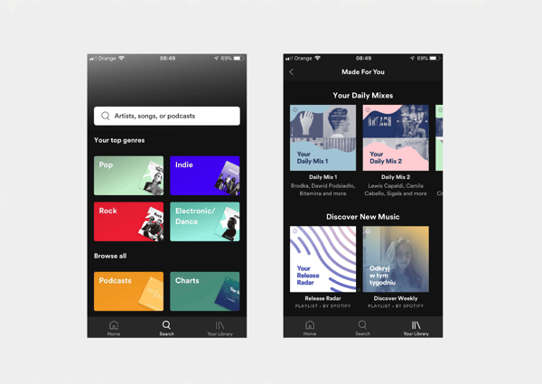
Spotify is a good example of the complexity of personalization. First, it recommends music that you like to listen to. Secondly, it shows songs that are new for you and somehow similar to what you like, or artists that are trending right now. But then it also gives you the opportunity to search by a specific mood and lets you switch to a whole different type of music. Again, prioritization matters here and, based on user interactions, Spotify assumes that the most important music is the music that you already know, then recommendations, and then exceptions.
 Spotify iOS Application
It’s important to also consider personalization in short interactions. For example, automatically filling in fields when users’ data is known; rearranging elements according to the data; showing first the fields that need to be most accessible. The same goes for search results: for a music app, consider previously searched songs but also songs of the same artists, and their most popular albums.
Personalization vs Customization
While shaping the concept of a product, think about the values and differences of personalization and customization.
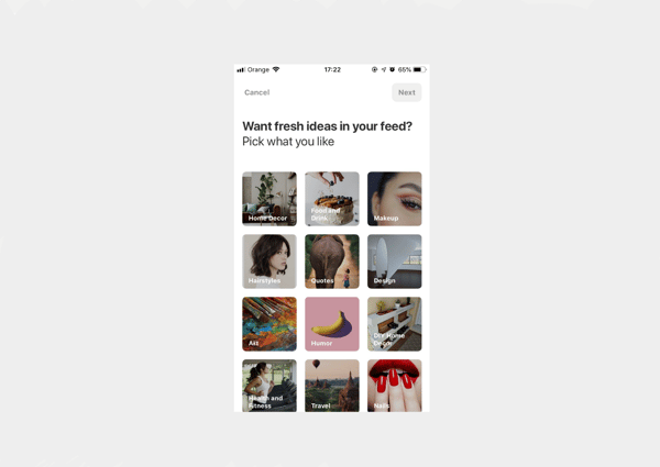
What differs them is that personalization is done by the system being used and customization is done by the user. With personalization, the system is learning from users’ behaviors and making assumptions to be able to suggest the right content. Therefore users are not consciously impacting the personalization process. With customization, the system is open for users to define their interests and needs. It may also involve the layout of the app or its features. In both cases there should be an opt-out provided so the user can control what content he/she gets. With customization, it should be easy to find where to adjust the settings in case a user changes their mind.
Pinterest iOS Application
When it comes to deciding whether to go with customization or personalization in your design, you have to ask yourself:
-
Is it important to show content suited for the right user from the start?
Personalization requires some time to gather data. If users expect accurate content at the very beginning, start with customization so they can choose what they want to see. After that, you can still use personalization to keep the content relevant.
-
Should I show my users the app first before demanding any engagement?
Generally, yes. Keep in mind the paradox of the active user — “a well-known phenomenon in user interface design: people are more motivated to start using things than to take the initial time to learn about them or to set up a lot of parameters.” By placing customization questions right after the launch you create a blocker for users to start using the app. That way you risk the fact that they will skip the customization part and will have a worse overall experience later on.
In that case, personalization gives more freedom for the user to just browse the app before giving any data consciously.
-
How big is the risk of showing inaccurate data based on personalization?
When it comes to e-commerce, we never know if users are buying gifts for others or themselves, and if they have already bought them or are still searching. Therefore the risk of showing inaccurate content is very high. On the contrary, music apps are less risky in that matter since the evaluation is much faster (users skip the songs they don’t want to listen to) but also we tend to keep music apps more personal, and playing music that we don’t like from our app to others is a rare case.
-
What's the social impact of constraining the content?
I mentioned the case of social media apps above. We can already see what happens if we keep people away from diverse sources of information. As designers, we have a huge impact on people’s lives and it’s our role to raise a hand if we identify a potential risk if our product succeeds.
A good compromise for a streamlined and focused experience is to consider both – personalization and customization in one product. Personalization reads our subconscious behaviors and learns from them. Thanks to customization, users are aware that the data they get is selected specifically for them and they can change the settings at any time.
Remember to keep customization to a minimum, not to overload the users with questions before they even get to know the product. In order to deliver the right information to the right users we have to carefully define their roles and attitudes and keep the data up-to-date over time both for customization and personalization.
 Author’s bio: Agnieszka gained her first experiences in the field of design while working in Warsaw-based startups as a Graphic Designer.
Now she’s leading the team of Graphic Designers and UX/UI Designers at Polidea, creating digital products starting from discovery workshops, through UX and UI design, finishing by supporting the engineers in implementation. Visit Polidea at www.polidea.com
Share this
You May Also Like
These Related Stories

[Video Interview] Let's Talk About Product Design

Complement your Marketing Strategy with User-Centred Design


