Dashboards, and more generally data visualisation, are powerful tools for any business. Whether you’re in marketing, sales, HR, or anything in between, being able to track and visualise your data in an easily shareable way makes you more effective and efficient. But have you thought about why that is? It’s more than just pretty pictures and colours, there is science behind why dashboards are such effective tools.
We’ve put together a list of some powerful - and interesting facts - that will show you why.
A history of data visualisation
Digital dashboards as we know them are relatively new. However, they sit within a greater tradition of data visualisation, which dates pretty far back. The history of dashboards, therefore, cannot be divorced from the history of data visualisation as a whole, so here are a few facts that show how we got to what we now know as data dashboards.
- The word dashboard originates from horse drawn carriages. A dashboard was a barrier of wood or leather at the front of a carriage or sleigh that protected the driver from mud, splashback, and debris “dashed up” by the horses. (The Saturday Evening Post)
- The idea for digital dashboards dates back to the 1970s, but the early predecessors weren’t developed until the 1980s in the form of Executive Information Systems (EISs). It wasn’t until the 1990s, however, that data and analytic systems evolved enough to give us the digital dashboards we know today. (Wikipedia)
- The concept of data visualisation dates back much further, to the ancient Egyptians. Egyptian surveyors are known to have used the concept of coordinates in laying out towns. Additionally, astronomical positions were located by a system similar to latitude and longitude by around 200 BC. (Treehouse Technology Group)
- Dashboard enthusiasts owe a lot to Scotland, or William Playfair more specifically. He is widely considered to be the inventor of many of the most popular graphs we use today (line, bar, circle, and pie charts) - all back in the late 18th century. (Dundas)
- The latter half of the 19th century is known as the Golden Age of statistical graphics. Three of the most famous examples of data visualisation from this time are: the map of the cholera outbreaks in London, created by John Snow in 1854; Charles Minard’s 1869 chart of Napoleon’s 1812 infamous Russian campaign army; and Florence Nightengale’s Rose Chart. (Dundas)
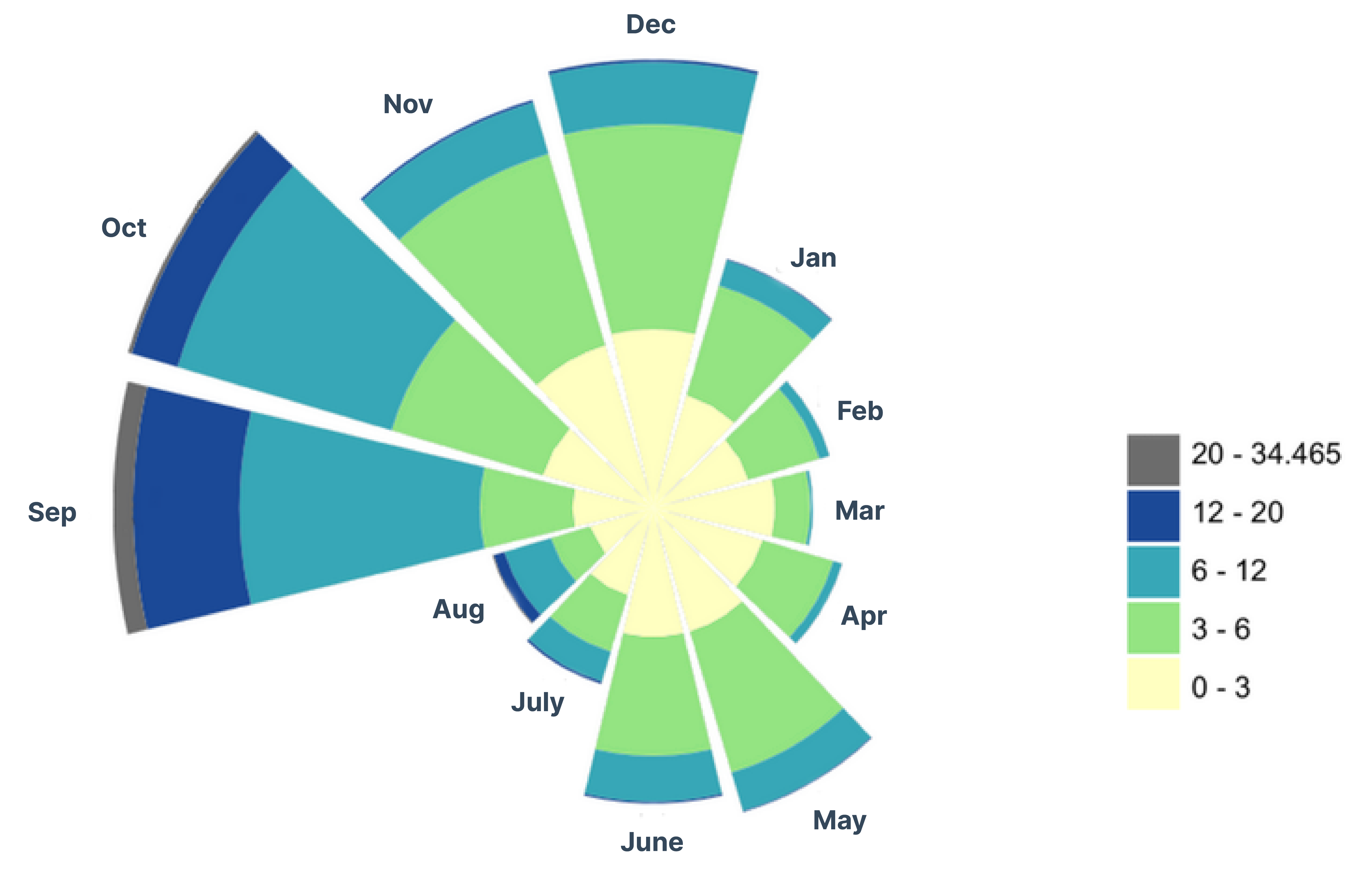
Source: Wikimedia Commons
How our brains process data
How we display data evolved in the way that it did largely because our understanding of how the brain processes information has grown. The brain is a magical thing and knowing why it does what it does allows us to create tools that harness its power properly.
- Visuals transmit information much more quickly than other forms of communication. The brain can see images that last for just 13 milliseconds. (MIT)
- Humans process visuals 60,000 times faster than text. In fact, the human brain deciphers image elements simultaneously, while language is decoded in a linear, sequential manner taking more time to process. (3M Corporation)
- Seeing can be better than hearing. Researchers found that people can retain 65% of the information three days after seeing data displayed as an image, compared to just 10% when they hear the information. (Research Gate)
- It only takes us 150 milliseconds to process a symbol or visual, and another 100 milliseconds to attach meaning to it. (NIH)
- The magic number is seven, or at least that’s what George A Miller’s theory purports. Millars Law states that the human brain can keep around 7 items in their working memory at one time. This means that humans have a finite amount of information they can process at one time, and that data overloads can affect our brain’s performance. (York University)
The case for dashboards
So, it’s apparent that we process information more effectively in visual formats. But what does that mean for businesses? Well, for one, it means that data visualisation tools like dashboards are essential to any good tech stack. But, there’s a lot more to it than that.
- The world is full of data. At the beginning of 2020, the amount of data in the world was estimated to be 44 zettabytes. (A zettabyte is 1,000 bytes to the seventh power, meaning one zettabyte has 21 zeros).

- This can lead to what’s called, data overload. But don’t worry, dashboards can help with that. A recent study showed when tasks were presented visually, i.e. with a dashboard, rather than using traditional text-based software applications, individuals used around 20% less cognitive resources. In other words, their brains were working a lot less. As a result, they performed more efficiently, and could remember more of the information when asked later. (BBC)

- With all that data, we’re wasting more time than ever trying to decipher it. However, data visualisation can be a great tool to combat this. A Wharton School of Business study found that the use of data visualizations could shorten business meetings by 24%. (American Management Association)
- Companies that embrace advanced data analytics and visualisations are:
- 2x as likely to be in the top quartile of industry financial performance
- 5x as likely to make decisions much faster than market peers
- 3x as likely to execute decisions as intended
- 2x as likely to use data very frequently when making decisions (Bain & Company)
- Dashboards can help in marketing and sales as well. A study found that if a claim is presented in pure words or numbers, 68% of people will believe that the information is accurate and truthful. But if you put a simple graph with the claim, the number rises to 97%. (Cornell University)
Bonus Fact
Facts don’t lie - humans are visual creatures and dashboards are a great way to harness that, allowing us to make better decisions. And guess what? Hurree is a superb tool to build those dashboards (I know, shameless plug). And you can get started with Hurree for free. Get started with your free trial by clicking the button below .
Share this
You May Also Like
These Related Stories

The Gestalt Principles: How to Use Them in Dashboard Design

6 Common Dashboard Design Mistakes and How to Avoid Them
