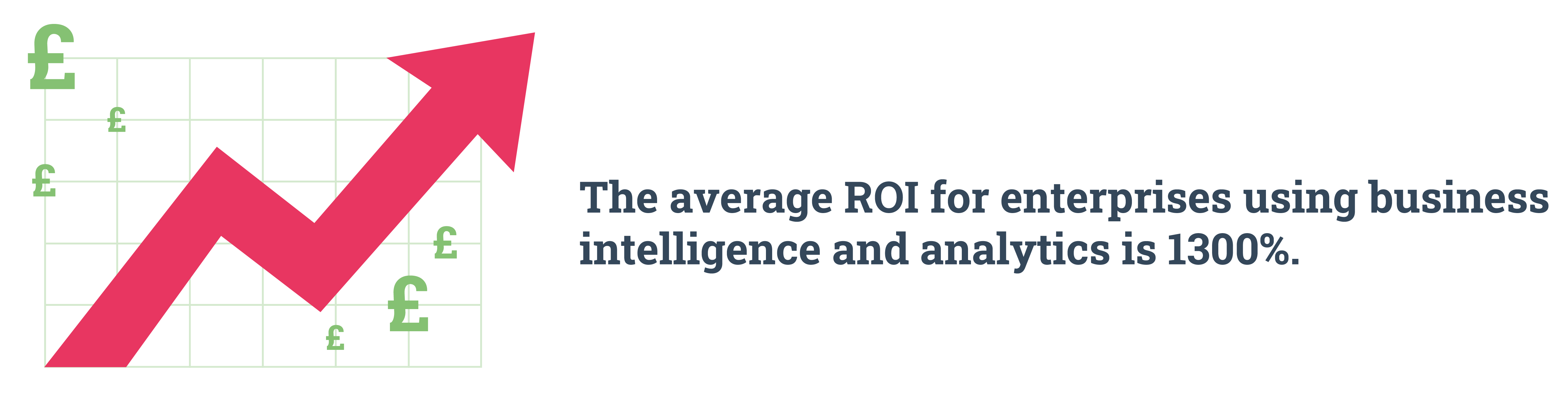
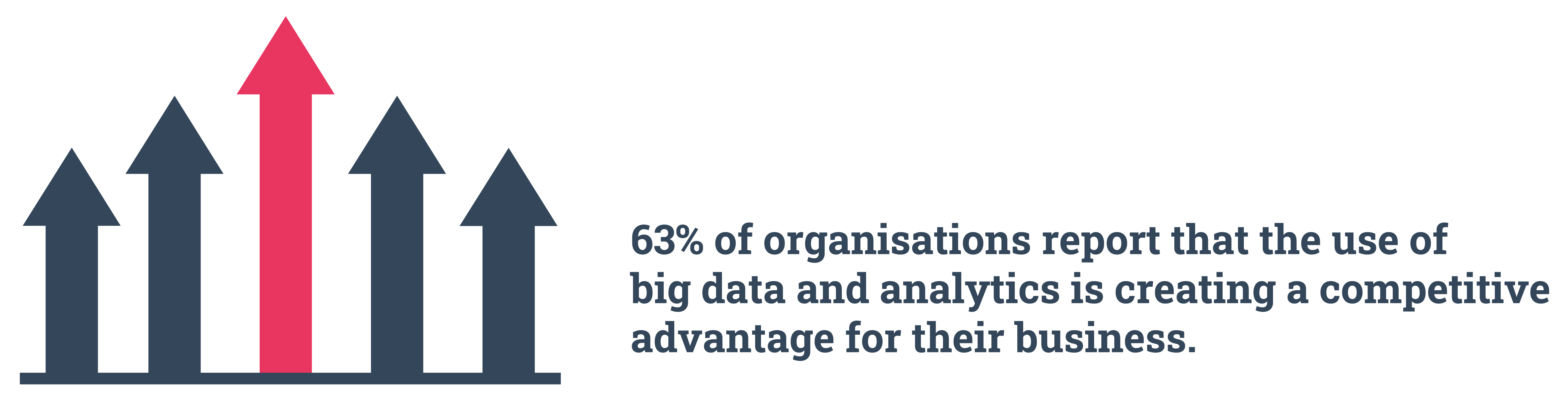
The volume, velocity, and variety of big data present in the 21st century are boundless. When utilised correctly, data has the power to increase an organisation’s productivity, knowledge, and the ability to personalise customer experiences. Analytics dashboards are the perfect tool to access and visualise the pieces of information that are most important to both your team’s day-to-day tasks and long-term strategies. They not only give you insight into your performance, but they offer the opportunity for you to have more control over it, too.
Within most companies, the sales department are one of the most data-driven team there is. Every activity undertaken is measurable and, for this department, numbers really count.

What are sales analytics?
In simple terms, sales analytics are insights generated from company and customer data. Analytics can range from simple KPIs (Key Performance Indicators), like the number of calls made or emails sent, to the more high-level predictive modelling techniques. The aim of utilising sales analytics is to gain a clear overview of your customers and your output. Attaining deeper insights into your data means you can set more strategic goals, improve your performance, make practical, data-driven decisions, and inform short or long-term business strategies.
According to Gartner: Sales analytics are used in identifying, modelling, understanding, and predicting sales trends and outcomes while aiding sales management in understanding where salespeople can improve. Sales analytics systems provide functionality that supports discovery, diagnostic and predictive exercises that enable the manipulation of parameters, measures, dimensions, or figures as part of an analytic or planning exercise.
Sales analytics are integral when it comes to keeping the team on an upwards trajectory and, as an inherently competitive space, having the right metrics available on a visual dashboard can inspire action and provide the team with focus.
What is a sales dashboard?
A sales dashboard is a visual representation of your sales data. It provides an ocular overview of your KPIs so that your team can get an at-a-glance understanding and make data-driven decisions based on these visual insights. Presenting analytical findings in this way is achieved through business intelligence.
Visual dashboards typically contain graphs, charts, maps, and more, to communicate the data of your customers, your campaigns, and a team’s performance.
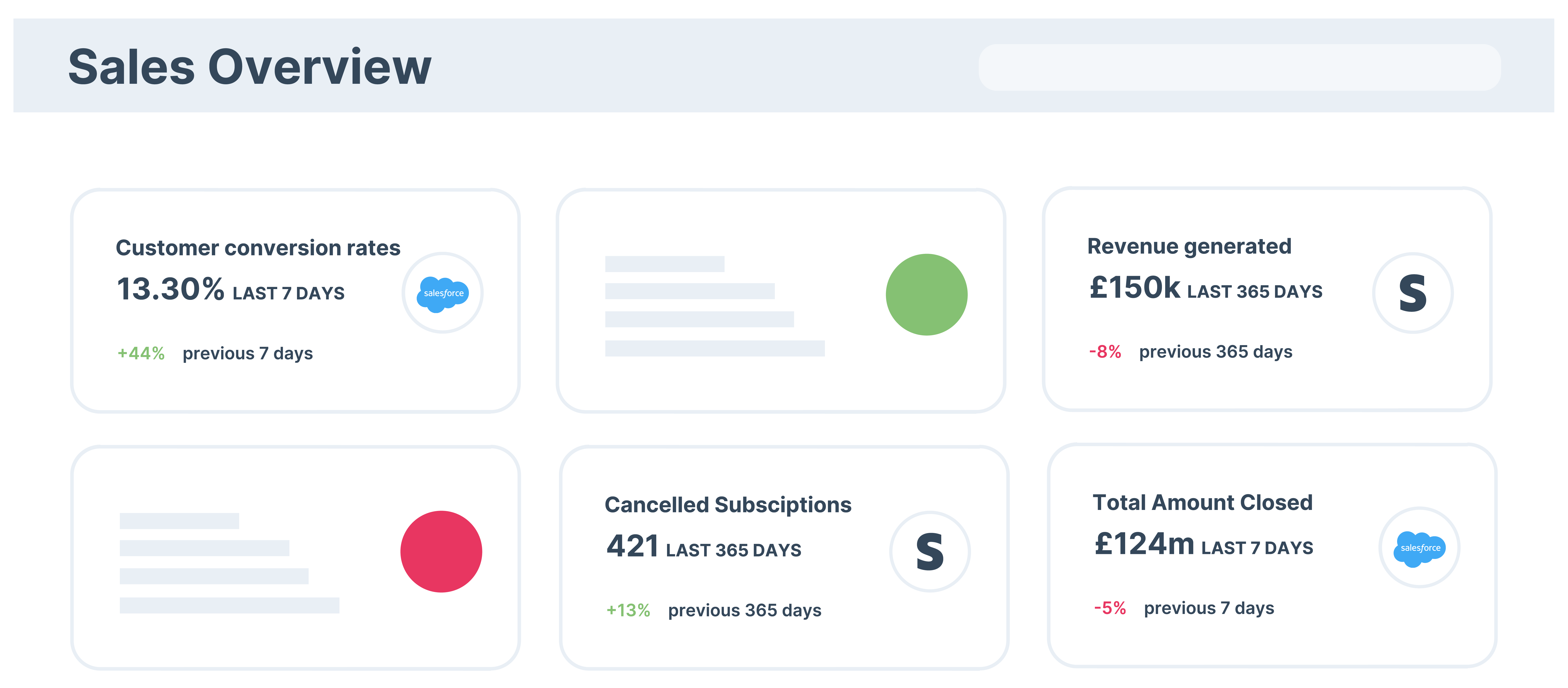
What to include in a sales dashboard
There are a number of baseline metrics that sales teams need to track in order to optimise performance and keep at the top of their game.
Here are our 12 KPIs that your team need to include in their sales dashboard:
1. Sales growth
For all businesses, the common goal is to grow revenue and evolve as a brand, so this metric is key. Sales growth measures how much your revenue changes over a fixed period of time and provides a structured general view of a team’s performance. It’s a central cog in the decision-making machine as it influences the design, creation, and execution of any business strategy.
2. Sales targets
This KPI tracks current performance and evaluates it against a wider business goal or objective. Your sales target can be based on revenue, the number of accounts you have, units of product sold, contacts gained, and so on.
To track this, you will need to first set a target. Your target could be set around last year’s growth rate, the revenue needed to remain competitive within your market, reducing customer churn, lowering customer acquisition costs, etc. Whatever your targets are, they need to be SMART.
3. Opportunities
In the sales realm, opportunities are qualified prospects that have a high probability of becoming a customer. They are typically associated with a deal and are organised based on their higher probability of closing the sale compared to, for example, a ‘lead’ or ‘prospect’. This metric includes the likes of calls made, emails sent and meetings booked.
4. Sales to date
The number of sales that have been made over a select period of time. Time frames typically include the past week, month, quarter, or year. Analytics dashboards may also give the option for you to input a custom date range so that you can compare the sales made over the month of August vs. September, for example.
‘Sales to date’ gives you a sense of historical trends and you can measure whether or not seasonality, new product release, a change in sales tactics, etc., have made an impact on your sales to present.
5. Product performance
This KPI ranks the profitability of each product you sell, giving you insight into what is well sought-after and what isn't. It can help you to see how high-cost vs. low-cost products compare. Context should also be considered when looking at this metric; examine how things like marketing campaigns, seasonality, promotional launches, or competition affect product performance.
You can dive deeper into the data and see which products reign supreme based on their type, colour, size, etc., and regulate your inventory accordingly.
6. Lead conversion rate
This shows how effective your team is at converting leads into new customers. Typically a combined marketing and sales process, lead conversion involves nurturing tactics such as retargeting and email nurturing in order to move prospects through several stages in an effort to transform them into a customer. Lead conversion rate helps to align sales and marketing teams throughout the customer journey, allowing you to optimise performance so you can improve customer experience, and spot any areas where your acquisition efforts require alteration.
7. Sales per rep
This is the performance metric for each individual sales representative. Things such as deals made and monetary value are taken into account. This metric is also context-dependent as sales reps have different levels of experience and areas of speciality that need to be considered, as well as the verticles that sales reps are working with (if appropriate).
The volume of sales made in different regions. Businesses will focus on different geographical areas depending on their product, service or brand. This metric can help you to determine where your products or services are selling best and then focus your sales and marketing efforts accordingly.
The number of products sold versus the total inventory. This allows you to monitor the efficiency of the network between your business and your suppliers. The sell-through rate informs your supply chain and helps in sales forecasting. Having a productive sell-through rate is key to keeping your business on target; ideally, you want your sell-through rate to be high. If it’s too low, that is a good indicator that there are issues within the organisation or sales process.
Having this metric available to hand will ensure that you’re not carrying a slow-moving product, or that you don’t run out of the products that are in high demand, and will help guide your inventory tracking process.
What’s the rate at which your leads and prospects are moving through your sales pipeline? This measures the average deal size, your average win rate, and the total number of SQLs that are in your pipeline. The pipeline velocity displays how much revenue is flowing through your pipeline and helps you to understand how prospects move through the pipeline.
This is a fundamental metric for any sales team. The quote-to-close ratio gives insight into both the quality of your leads and the quality of your sales process; it determines the percentage of prospects your sales and marketing team have generated compared to the number of deals won, i.e. the SQLs that turn into legitimate paying customers.
This metric essentially illustrates how well your team moves prospects through the entire sales funnel. Looking into this metric gives you information as to where you need to make adjustments to your pricing, your target audience, or if your team requires more training.
12. Average purchase value
Also known as the average sales value, this examines the average value of every transaction, helping you to develop revenue projections and forecasting.
By understanding and examining the average sales value of each transaction, you can better comprehend consumer purchasing behaviours that develop and improve future strategies. You can also quickly estimate how many customers and/or purchases you would need to reach a revenue goal, for example. With this information, you can determine what needs to be prioritised, i.e. marketing campaigns, upselling, and so on.
Many analytics dashboards, like Hurree, allow teams to ask questions such as:
- What trends are we seeing in our data?
- Have our opportunities improved over the past quarter?
- How are our sales representatives performing?
- Are there any clear opportunities for cross-selling or up-selling?
- In which region are we seeing our highest sales?
- Where are we sitting in terms of our goals - are we on the right track to achieving them or are we underperforming?
Of course, the metrics that you measure and those that appear on your analytics dashboard will vary depending on the industry that you work in, the products or services you sell, and the size of your sales team.
Conclusion
Transparency within a business is vital for both current and future operations. This is particularly significant within your sales process and output. Sales analytics gives you insight into things like your hot and cold leads, where you need to tweak your strategy, and the performance of your sales agents, which can help to improve your targets and revenue flow.
Having your sales analytics available on one complete dashboard gives organisations benefits such as heightened visibility, increased efficiency, better forecasting, improved decision-making, enhanced customer experience, and greater control.
As with most software tools, where there are benefits there are also challenges. This can include ensuring that the data you collect is all GDPR compliant, that the metrics you’re gathering and measuring are meaningful, rather than just being present to populate a dashboard, and that you can fully utilise the information that you have.
Book a free demo of Hurree today and discover how to truly harness the power of analytics and transform your company reporting using cross-platform dashboards. If you have any questions then feel free to reach out to contact@hurree.co, we'd be happy to answer them!
Share this

[Infographic] What are Analytics Dashboards?

6 Benefits of KPI Reporting